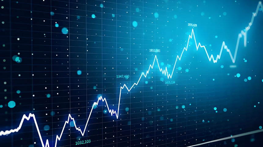
If you're investing in anything—stocks, bonds, real estate, even just holding cash—you're betting on the direction of interest rates. And there's no better single picture of where rates are, and where they might be headed, than the U.S. Treasury yield chart. Most people glance at it, see a squiggly line, and move on. That's a mistake. This chart is the closest thing the financial world has to a collective crystal ball, reflecting everything from inflation expectations to global risk appetite. Ignoring it is like driving without looking at the road signs.
I've traded bonds for over a decade, and I can tell you the yield curve has saved me from bad bets more times than any analyst report. The trick isn't just looking at it; it's knowing how to look.
What You'll Learn in This Guide
What a Treasury Yield Chart Actually Shows You
Let's strip away the jargon. A U.S. Treasury yield chart plots the interest rates (yields) the U.S. government pays to borrow money for different lengths of time. You'll see maturities from one month out to thirty years. The line connecting these dots is the yield curve.
Think of it as the market's price list for safety. When you buy a 2-year Treasury note, you're locking in a rate for two years. When you buy a 10-year bond, you're committing for a decade. The difference in yield between these points tells a story about investor expectations.
The most watched data comes directly from the U.S. Treasury Department itself, published daily. Financial sites like the Federal Reserve or Bloomberg display it, but the source is the primary market auctions.
Why This Chart is Your Most Important Economic Indicator
Forget the noisy headlines for a minute. The bond market is massive, with professional traders betting trillions of dollars daily. The yield curve is their aggregated, real-time forecast. It's not perfect, but it's brutally honest.
The key insight: The shape of the curve changes based on two main forces: expectations for future Federal Reserve policy (short-term rates) and expectations for long-term economic growth and inflation.
A steep, upward-sloping curve? The market expects strong growth and maybe higher inflation down the road. A flat curve? Growth expectations are muted. An inverted curve (where short-term rates are higher than long-term rates)? That's the market's classic warning signal for a potential recession. It's not a guarantee, but historically, it's been a reliable alarm bell.
How to Read the Yield Curve Like a Pro
Don't just look at whether the line is up or down. You need to examine specific relationships.
Key Spreads to Watch Constantly
These are the specific yield differences traders live by.
| Spread (Yield Difference) | What It Measures | Why It's Important |
|---|---|---|
| 2-Year vs. 10-Year | Medium-term growth/inflation outlook vs. long-term. | The most famous recession indicator. Inversion here often makes front-page news. |
| 3-Month vs. 10-Year | Immediate Fed policy vs. long-term outlook. | Preferred by many economists (like those at the NY Fed) for recession forecasting. It can be less noisy. |
| 5-Year vs. 30-Year | Medium-term vs. ultra-long-term expectations. | Great for gauging long-run inflation fears and the "terminal rate" view. |
Here's a non-consensus point: everyone obsesses over the 2s10s spread. I pay more attention to the 3-month/10-year spread. Why? The 2-year yield can get distorted by technical factors and specific Fed meeting expectations. The 3-month bill is almost pure Fed policy. The signal tends to be cleaner.
Beyond Inversion: The Three Main Curve Shapes
Normal/Steep Curve: Longer-term yields are higher. This is the healthy, "growing economy" shape. Banks love this because they borrow short (low rates) and lend long (high rates).
Flat Curve: Little difference between short and long yields. This suggests uncertainty. The market thinks growth will be slow, and the Fed may be done hiking rates.
Inverted Curve: Short-term yields exceed long-term yields. This is the big red flag. It means investors are so worried about the near future that they're willing to accept a lower yield to lock money away for 10 years than for 2 years. They're pricing in future rate cuts by the Fed, usually due to an expected economic slowdown.
Practical Uses for Your Portfolio
Okay, theory is fine. But what do you do with this?
For Stock Investors: A steepening curve (after a period of flatness) can be a great early signal for cyclical sectors—think financials, industrials, materials. Banks make more money. An inverted curve? It's time to be defensive. Reduce exposure to high-debt companies and consider sectors like consumer staples or healthcare. It's not about selling everything, but about tilting your weight.
For Bond Investors: This is your home turf. A flat or inverted curve is a terrible environment for traditional "buy and hold" long-term bonds. You're not getting paid enough for the extra risk of a long duration. In these times, I stick to the short end of the curve (1-3 year notes) or use Treasury ETFs that target specific maturities. When the curve is steep, moving out to 7-10 year notes can capture more yield.
For Everyone (Asset Allocation): The curve is a fantastic gut-check for your overall risk level. A deeply inverted curve is the market screaming that trouble may be ahead. It's a signal to build cash, reduce leverage, and review your emergency fund. It's not a timing tool for the day the recession starts, but a warning to get your house in order.
Common Mistakes Even Smart Investors Make
I've seen these errors cost people a lot.
Mistake 1: Overreacting to Daily Wiggles. The day-to-day movement of a single yield (like the 10-year) is noise, often driven by technical trading or a single economic report. The shape of the entire curve changes much more slowly and meaningfully. Don't check it every hour. A weekly glance is more than enough.
Mistake 2: Treating Inversion as an Immediate "Sell" Signal. This is the big one. An inversion has historically preceded a recession by 12-24 months. The stock market often continues to rally for months after the initial inversion. Using it as a short-term market timing tool will have you selling too early, repeatedly. Its value is strategic, not tactical.
Mistake 3: Ignoring the Front End. Everyone looks at the 10-year yield. But the yields on 3-month or 1-year bills tell you what the market thinks the Fed will do now. If those are spiking, liquidity is tightening fast, which pressures all risky assets.
I made Mistake #2 early in my career. I saw the curve invert in late 2005 and went heavily into cash. I missed a solid 18+ months of gains before things finally turned. The signal was right, but my interpretation of its timing was painfully wrong.
Going Deeper: Advanced Tactics
Once you're comfortable with the basics, layer in these concepts.
Real Yields: This is the yield after subtracting expected inflation (using TIPS spreads). A rising real yield on the 10-year note means the market is demanding more compensation for real growth, which can be a major headwind for high-valuation tech stocks. The St. Louis Fed's FRED database is the best source for this data.
Global Context: The U.S. curve doesn't exist in a vacuum. Compare it to the German Bund curve or the Japanese Government Bond (JGB) curve. If the U.S. curve is steep while Europe's is inverted, it tells you the growth story is stronger in the U.S., which can drive dollar strength.
The "Term Premium": This is the extra yield investors demand to hold a longer-term bond instead of rolling over short-term ones. When it's negative (as it often is during inversion), it confirms the fear-driven dynamic. Research from the New York Fed provides estimates on this.
Your Questions Answered
The yield curve has been inverted for a while, but no recession has hit. Is it broken?
It's a fair question. The signal isn't broken, but its timing mechanism has always been variable. An inversion means the bond market sees a high probability of future economic stress, forcing the Fed to cut rates. Unprecedented fiscal stimulus, changes in banking regulation, and a resilient consumer can delay the onset. However, every significant inversion since the 1950s has eventually been followed by a recession or a major economic downturn. The curve is warning of a condition, not setting a calendar date.
I'm a retiree living on fixed income. How should I use the yield chart right now?
Your primary goal is capital preservation and income. In the current environment of a flat-to-inverted curve, the classic "ladder" strategy works well. Don't reach for yield by buying long-term bonds. Instead, build a ladder of Treasuries maturing every 6-12 months over the next 2-3 years. This gives you predictable cash flow and the flexibility to reinvest at higher rates if they rise. The chart tells you there's little extra income reward for going beyond 2 years, so don't take the duration risk. Stick with the front end.
Can the Fed directly control the yield curve?
They can influence it heavily, but not completely control it. The Fed sets the shortest-term rate (the Fed Funds rate). Through forward guidance and Quantitative Easing (QE) or Tightening (QT), they can buy or sell bonds to pressure longer-term yields—a policy called Yield Curve Control (YCC), which they flirted with during COVID. However, the long end of the curve is ultimately driven by global investor expectations for growth and inflation. If the market loses faith in the Fed's inflation fight, long yields can rise despite the Fed's wishes. The chart is a dialogue between the Fed and the market, not a monologue.
What's one subtle sign in the chart that most people miss?
Watch for bull steepening vs. bear steepening. Both mean the curve is getting steeper, but they imply opposite things. Bull steepening happens when long-term yields fall faster than short-term yields (often early in a recession when the Fed is expected to cut). Bear steepening happens when short-term yields rise faster than long-term yields (often during an overheating economy). Most headlines just say "the curve steepened," but which one it is tells you the next likely phase of the cycle.
The U.S. Treasury yield chart isn't a magic eight-ball. It won't give you exact dates or prices. But it is the most honest, high-signal financial chart you have access to. It forces you to think in terms of probabilities and time horizons, not certainties and tomorrow's trade. Start by simply observing its shape each week. Ask yourself what that shape implies about the market's story. Over time, you'll begin to see the road signs before you hit the turns, and that's an edge most investors never develop.

Comment desk
Leave a comment